Styling the Web with CSS

CSS, Cascading Style Sheets, transforms raw HTML into visually engaging web experiences. It controls colors, typography, layout, animations, and responsive behavior. Without CSS, web pages would be plain text documents in browser default styles. With CSS, they become designed interfaces reflecting brand identity and aesthetic intention.
Styling the Web with CSS
The core concept is separation of content from presentation. HTML handles structure and meaning; CSS handles appearance. This separation enables flexibility: same HTML can be styled differently for different devices, print versions, or themes. It also makes maintenance easier—change one CSS file to update entire site’s appearance.
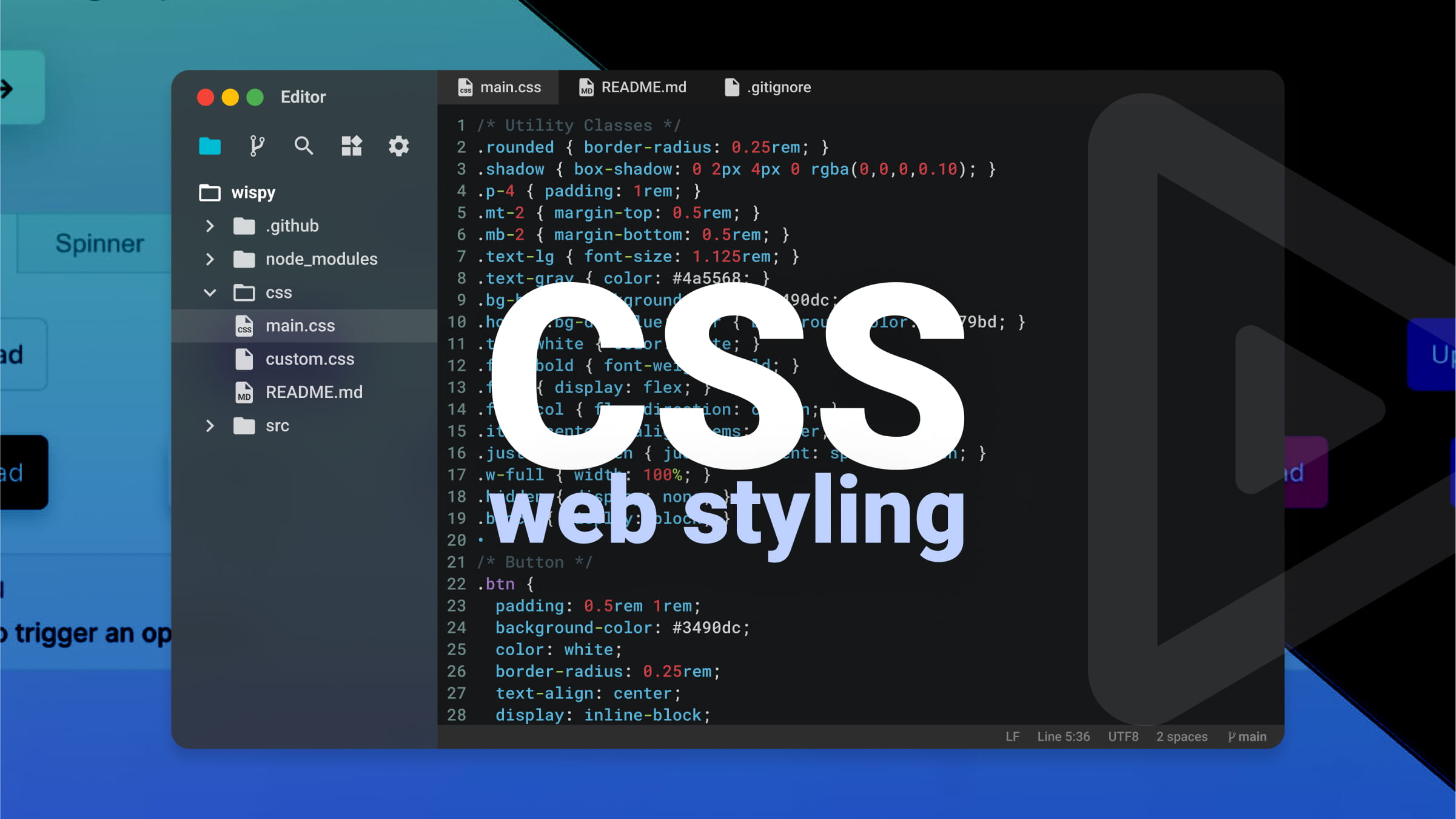
CSS syntax is straightforward. Selectors target HTML elements: p selects all paragraphs, .class selects elements with specific class, #id selects element with specific ID. Declarations inside curly braces specify properties and values: color: blue; makes text blue, font-size: 16px; sets text size. Multiple declarations style elements comprehensively.
The cascade determines which styles apply when multiple rules target same element. Rules can come from multiple stylesheets, browser defaults, or inline styles. Cascade considers importance, specificity, and source order. Understanding cascade prevents frustration when styles don’t apply as expected.
Specificity calculates which selector “wins” when conflicts arise. Inline styles have highest specificity, followed by IDs, classes/attributes, and element types. More specific selectors override less specific ones. When specificity equal, later rules override earlier. This system enables precise control while maintaining flexibility.
The box model underlies CSS layout. Every element is rectangular box with content, padding (space around content), border, and margin (space outside border). Understanding box model is essential for controlling spacing and layout. box-sizing: border-box simplifies by including padding and border in element’s total width.
Layout techniques have evolved dramatically. Early web used tables for layout. Then floats enabled text wrapping around images but were hacked for layouts. Flexbox, introduced for one-dimensional layouts, makes distributing space along rows or columns intuitive. Grid, for two-dimensional layouts, provides unprecedented control over rows and columns simultaneously.
Responsive design adapts layouts to different screen sizes. Media queries apply different styles based on viewport width, device orientation, or other characteristics. Mobile-first design starts with small screen styles, then adds complexity for larger screens using min-width media queries. This approach ensures usability across devices.
Typography on web involves more than choosing fonts. font-family specifies typefaces, with fallbacks for when preferred fonts unavailable. font-size controls size; rem units relative to root element enable consistent scaling. line-height affects readability. letter-spacing and word-spacing refine appearance. Web fonts allow custom typefaces via @font-face.
Color brings designs to life. Named colors, hexadecimal (#ff0000), RGB (rgb(255,0,0)), HSL (hsl(0,100%,50%)), and modern notations offer flexibility. Opacity adds transparency. Gradients create smooth transitions. Color choice affects accessibility; sufficient contrast between text and background essential for readability.
Animations and transitions add polish. Transitions smoothly change property values over time when triggered by hover, focus, or other state changes. Keyframe animations define complex sequences. Used judiciously, motion enhances user experience; excessive animation distracts and annoys.
Preprocessors like Sass and Less extend CSS with variables, nesting, mixins, and functions. They compile to standard CSS but make authoring more efficient and maintainable. Post-processors like Autoprefixer automatically add vendor prefixes for broader browser support. Modern tooling enhances CSS workflow.
CSS frameworks provide pre-written components and utilities. Bootstrap, Tailwind, Foundation accelerate development with consistent, tested patterns. Tailwind’s utility-first approach differs from traditional component frameworks, offering different tradeoffs. Frameworks speed development but can limit creativity if over-relied upon.
Browser Developer Tools inspect and debug CSS. Elements panel shows applied styles, box model dimensions, and which rules override others. Changes can be tested live before committing to code. Mastering DevTools is essential for efficient CSS development.
CSS continues evolving. Container queries finally allow elements to respond to their parent container size, not just viewport. Cascade layers give finer control over specificity. Subgrid simplifies complex grid layouts. Modern CSS grows more powerful while maintaining backward compatibility.
Learning CSS means understanding selectors, cascade, box model, layout, and responsive principles. It means thinking visually and systematically. CSS can frustrate beginners, but mastery rewards with ability to bring designs to life exactly as imagined.